

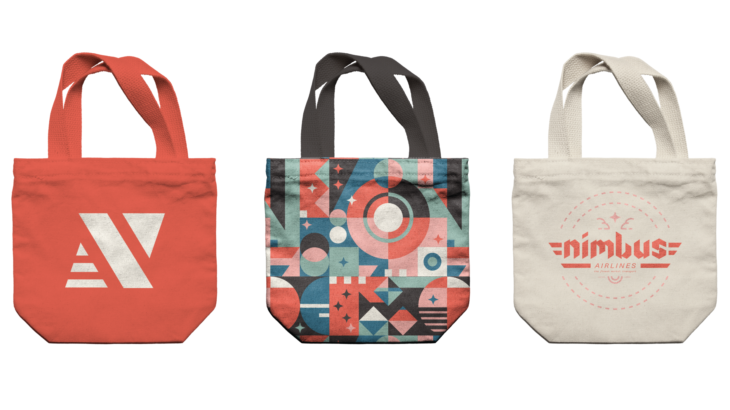
Nimbus Airlines
Branding, Lettering, Pattern Design, Iconography, Design Research
How do you design an airliner specifically for the magical beings among us? You hide it in plane sight. This project took off with a focus on custom typography, and landed on a brand identity influenced by 1950s aviation ephemera smashed with sixteenth century illuminated lore. A.K.A. the contents of my brain at almost all times.
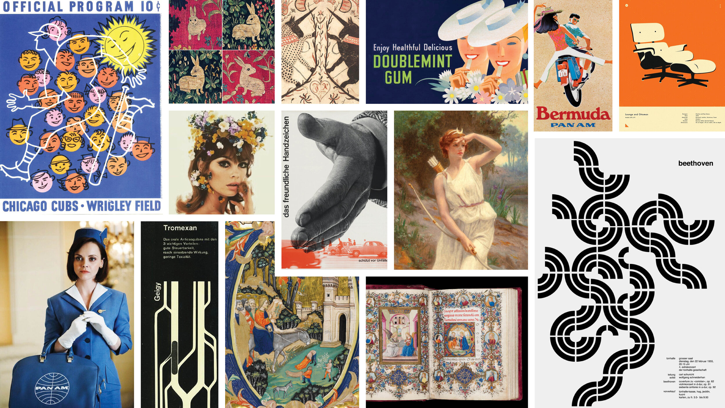
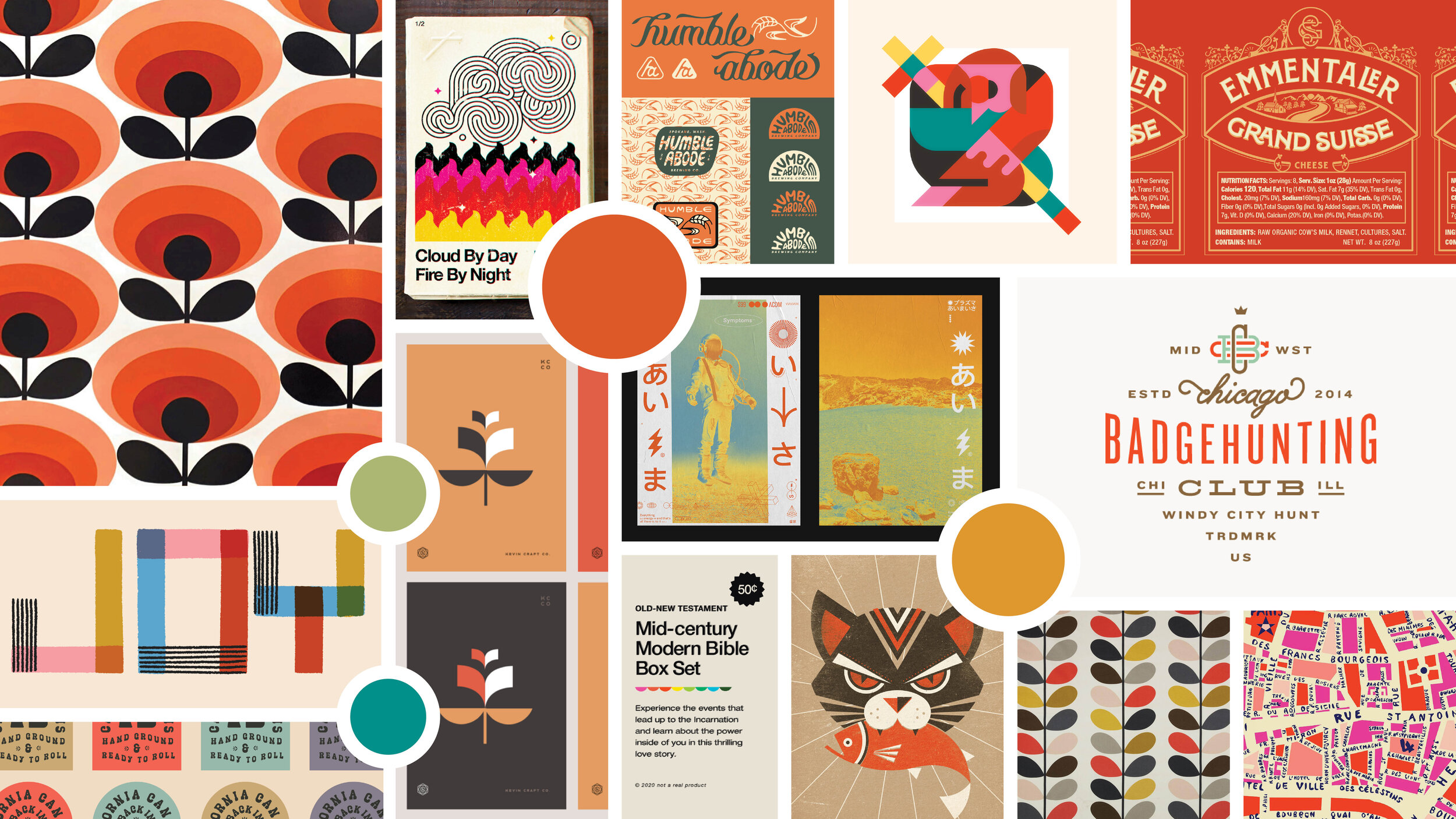
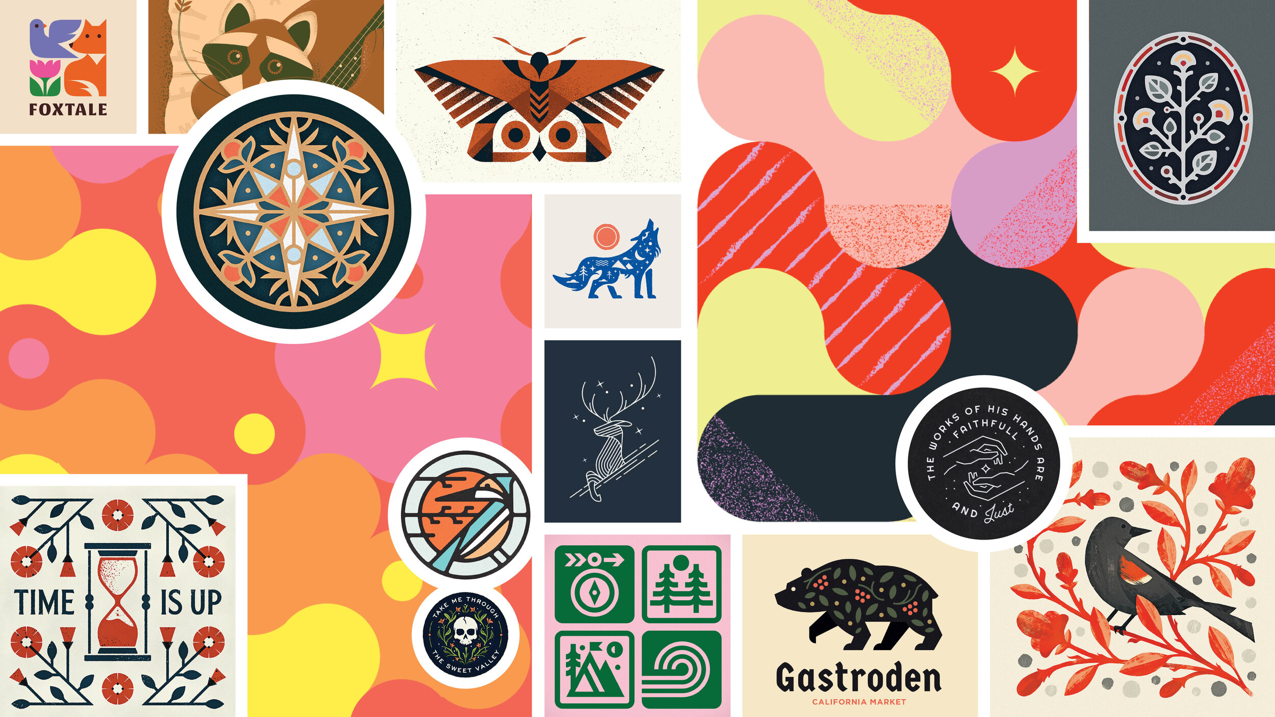
I love making moodboards. To set the tone for this project when I pitched it to my professor (the exquisite Rachel Dangerfield), I put together four moodboards that summarized my influences for typography, graphic stylings, color, and historical references.


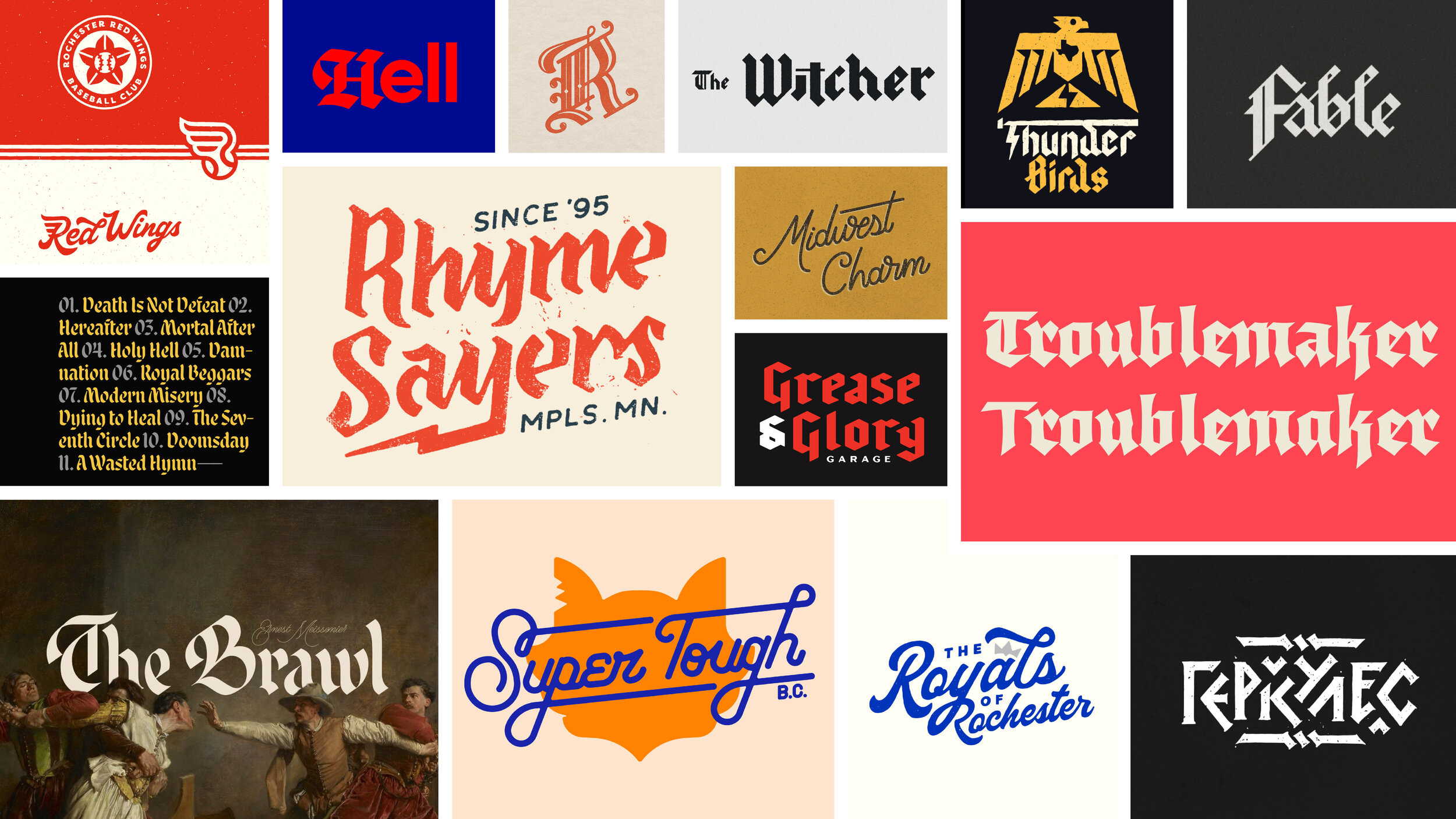
As I mentioned, this project’s main focus was to create custom typography that communicated a voice beyond just some letters. I probably spent a good week combing through online archives and sketching everything I found inspiration from; weaving flourishes of 16th century fraktur, streamlined midcentury monolines, combined with whatever other nonsense my brain could come up with. To dig deeper into the process of this project, check out my post over on Behance.


Corporate Accountability

Baymax Health

Brownbox